Industry
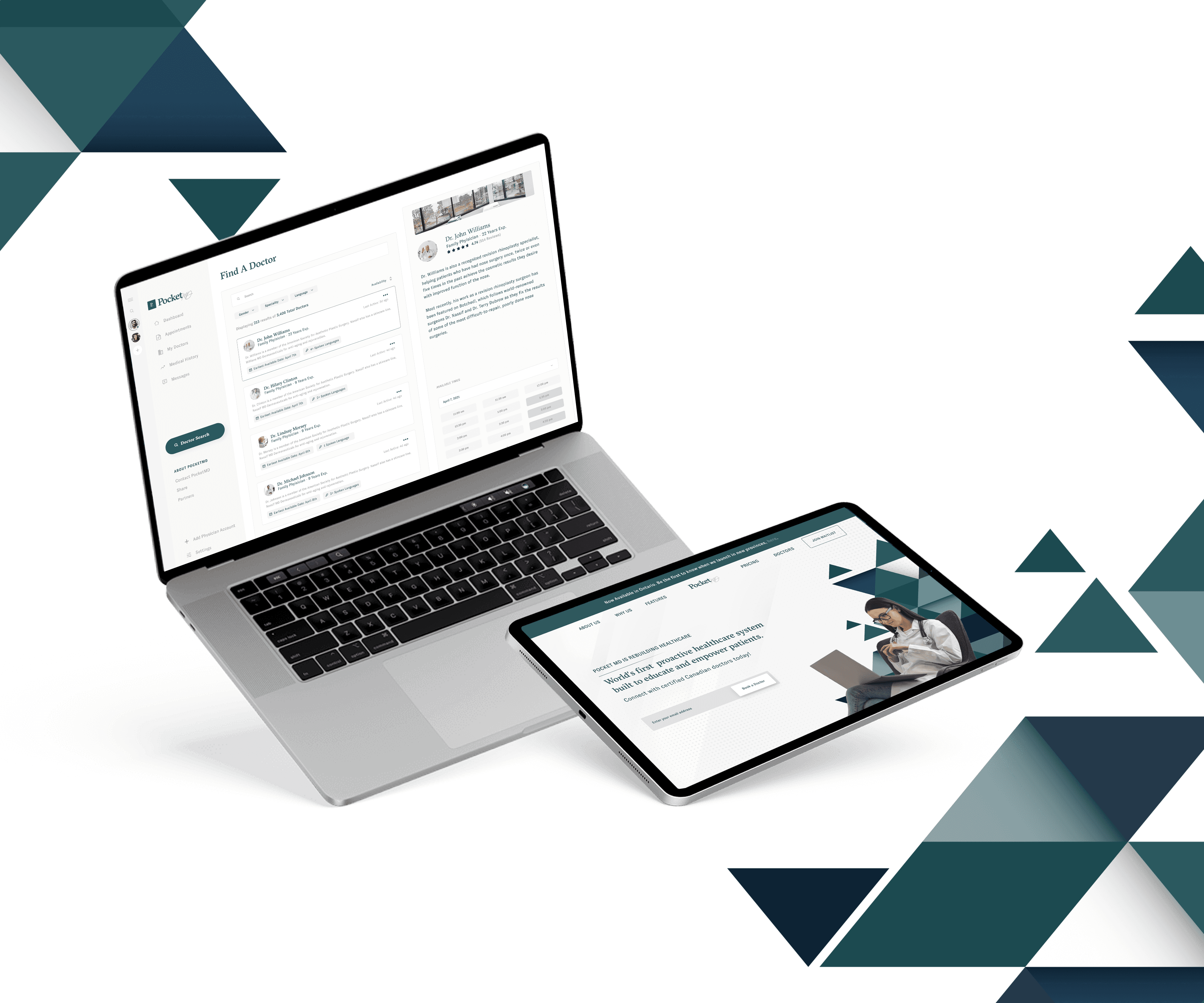
Healthcare
Company
PocketMD
Developing Iceberg - Auvik's Design System
Developing Iceberg - Auvik's Design System
Developing Iceberg - Auvik's Design System
Product
Web Application
Role
Product Designer, Designs Systems Lead
Timeline
Q4 2021 - Q4 2022
While working at Auvik, I was responsible for spearheading the development and integration of Iceberg, the company wide design system, to unify design across Auvik.
Working closely with other product designers, product managers, engineers, and various stakeholders, I had to advocate for the design system across the organization and quickly became the Design Systems Lead. Working within the Platform UI feature team, I was also required to facilitate cross-functional design sprints with engineers and product managers to design viable solutions for Auvik 2.0.
Product
Web Application
Role
Product Designer, Designs Systems Lead
Timeline
Q4 2021 - Q4 2022
How might we improve the design process at Auvik and provide a scalable user interface for Auvik 2.0
How might we improve the design process at Auvik and provide a scalable user interface for Auvik 2.0

Sketch files that the design team were left with from previous designers

Audit for all of the Button components
Problem
When I was hired at Auvik Networks, there wasn’t a design system in place - but rather a drive full of Sketch files.
So as a result, we had inherited a problem of inconsistent components and patterns that had developed within the product over the years.
Sketch files that the design team were left with from previous designers
Sketch files that the design team were left with from previous designers
Audit for all of the Button components
Research
As I had prior experience building out a design system at my previous company, it was never to this scale and complexity. So I had to do my initial research in properly setting up and creating a Design System for a web application with existing components and patterns. I studied guidelines and design systems laid out by Google, Facebook, and Apple and assessed Shopify’s Polaris and IBM ‘s Carbon Design System.
Two of the best resources I found were the book Atomic Design, by Brad Frost, and a site called Pattern Lab. Frost’s book detailed the creation and maintenance of robust design systems while Pattern Lab served as an example of what a living design system might look like.
Solution
In order for our design and engineering teams to increase velocity and reduce entropy, Auvik needed a design system to be a central hub for brand and product assets. The Design System would also provide everything needed for designers, developers and product owners to define, design, develop and deploy consistent user experiences with reusable components and built in guidelines.
As Auvik was strategically moving upmarket with new products for Auvik 2.0, a redesign of the user interface was also required to provide new components and patterns that scale.
Research
As I had prior experience building out a design system at my previous company, it was never to this scale and complexity. So I had to do my initial research in properly setting up and creating a Design System for a web application with existing components and patterns. I studied guidelines and design systems laid out by Google, Facebook, and Apple and assessed Shopify’s Polaris and IBM ‘s Carbon Design System.
Two of the best resources I found were the book Atomic Design, by Brad Frost, and a site called Pattern Lab. Frost’s book detailed the creation and maintenance of robust design systems while Pattern Lab served as an example of what a living design system might look like.
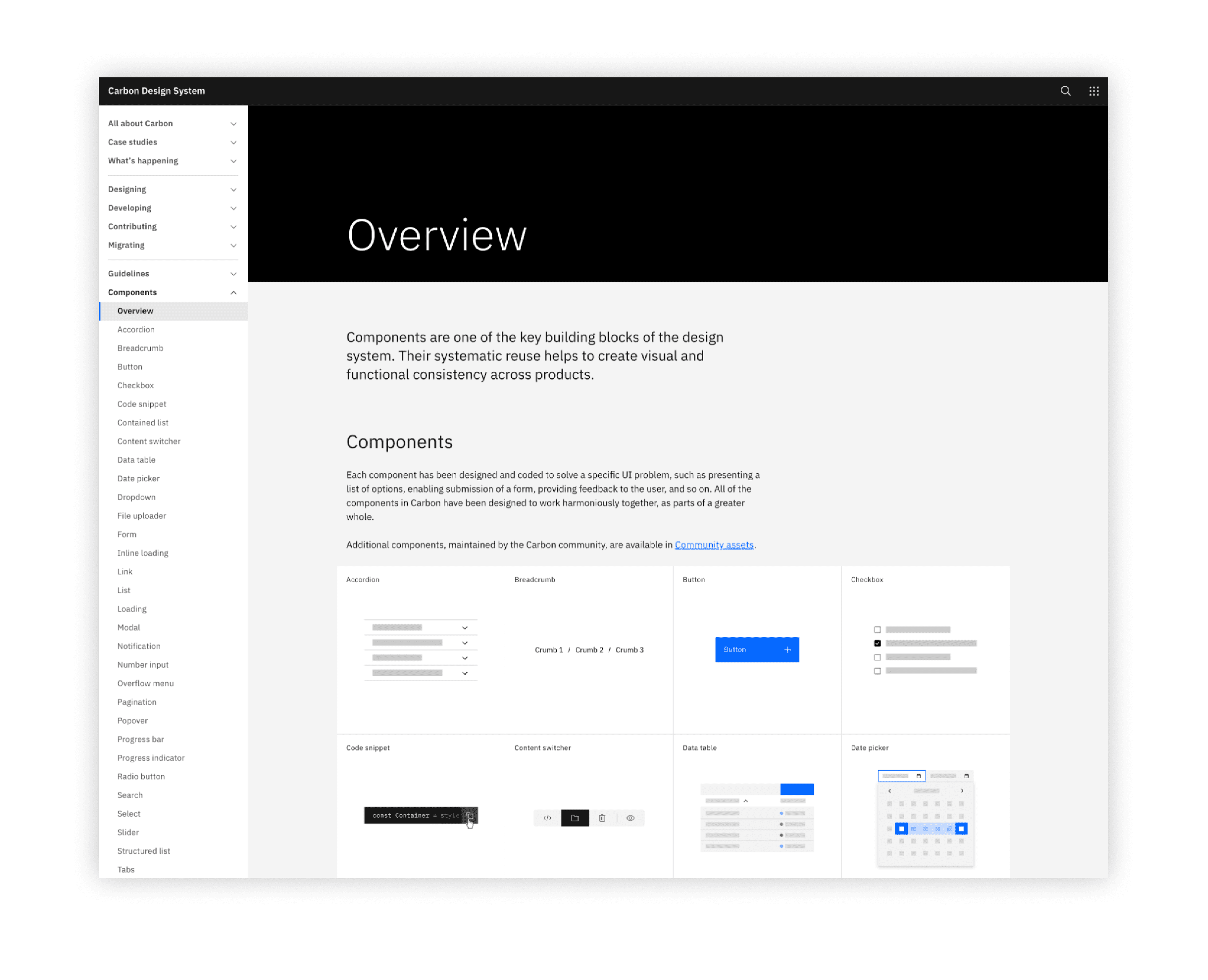
IBM's Carbon Design System

Shopify's Polaris Design System
IBM's Carbon Design System
Shopify's Polaris Design System
Solution
In order for our design and engineering teams to increase velocity and reduce entropy, Auvik needed a design system to be a central hub for brand and product assets. The Design System would also provide everything needed for designers, developers and product owners to define, design, develop and deploy consistent user experiences with reusable components and built in guidelines.
As Auvik was strategically moving upmarket with new products for Auvik 2.0, a redesign of the user interface was also required to provide new components and patterns that scale.
This in turn caused 2 major issues within Auvik:
This in turn caused 2 major issues within Auvik:
Inconsistent components and patterns
Working within a design team that didn’t have a design system was very challenging. Without a design system being the single source of truth for how components and patterns are supposed to be built, meant that there were going to be inconsistencies within the product.
Current UI patterns were not scalable
Within 2022, Auvik had acquired 3 new companies with their plan to expand and improve their product offering. The company took major strides to strategically move upmarket, increasing the scale demands for their products and enhancing the platform to support new patterns. Unfortunately, the way the current components and patterns were set up did not allow the platform to scale.
Solution
In order for our design and engineering teams to increase velocity and reduce entropy, Auvik needed a design system to be a central hub for brand and product assets. The Design System would also provide everything needed for designers, developers and product owners to define, design, develop and deploy consistent user experiences with reusable components and built in guidelines.
As Auvik was strategically moving upmarket with new products for Auvik 2.0, a redesign of the user interface was also required to provide new components and patterns that scale.
Figma Design Kit
So I created a system to categorize the components and patterns effectively, and designed each component to match the Storybook and Web assets. With each inconsistent component, I would review them with the design and engineering teams to refactor them as deprecated assets to be removed. I created the Figma components and variants for each state in Figma and had to make decisions regarding naming conventions, categorization and presentation.
Audit
With a strategy in mind to build out the design system, the first task was to inventory every UI element in our application. I went through our Nanook UI and Web client component libraries in Storybook and inspected our platform to capture every button, input field, and design pattern.
With this exercise, I found that there were dozens of form field styles, single use icons, and incorrectly applied font weights and sizes across the platform.
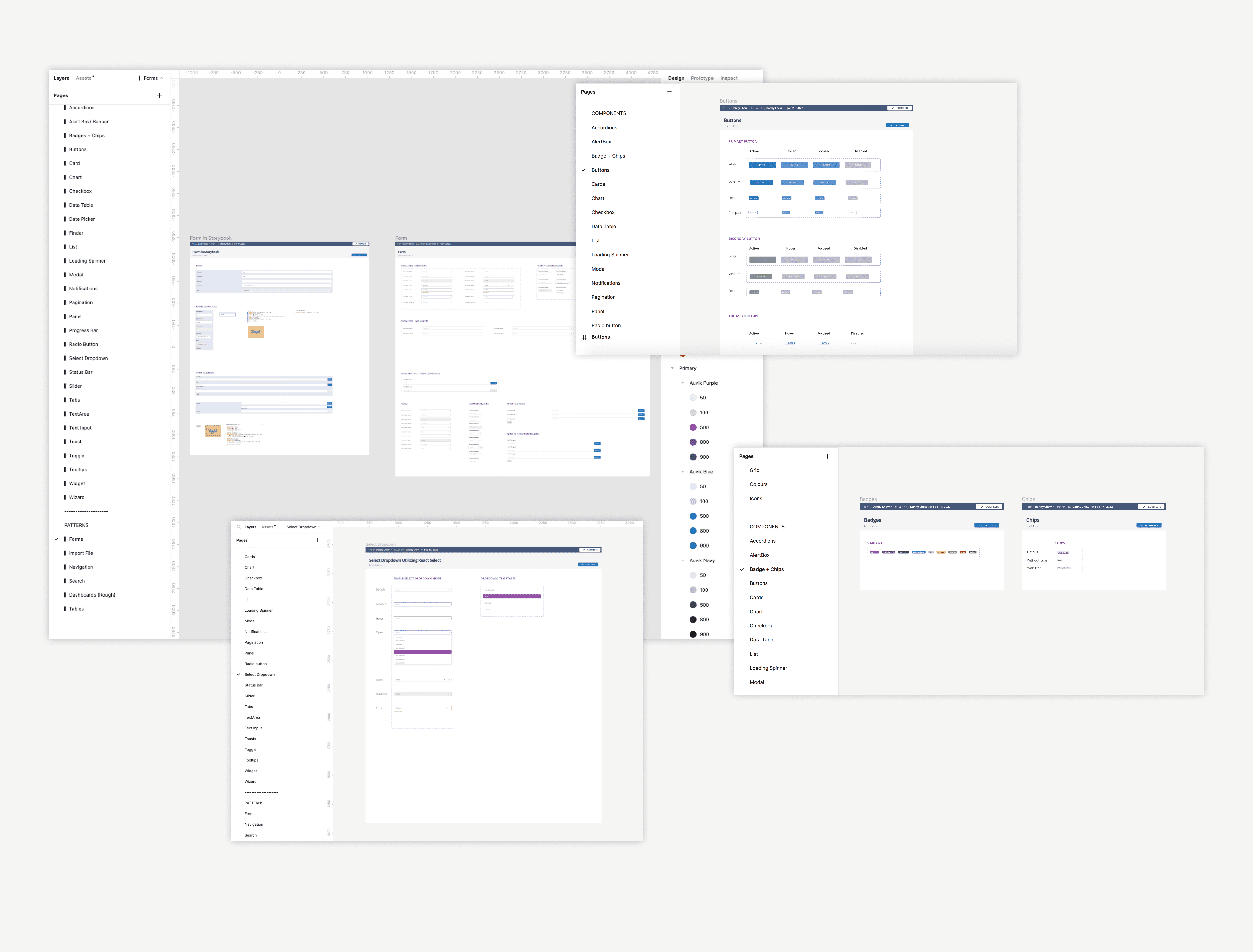
Iceberg - Figma Design System
Figma Design Kit
So I created a system to categorize the components and patterns effectively, and designed each component to match the Storybook and Web assets. With each inconsistent component, I would review them with the design and engineering teams to refactor them as deprecated assets to be removed. I created the Figma components and variants for each state in Figma and had to make decisions regarding naming conventions, categorization and presentation.
Colour Consolidation
I went through the NanookUI library and found that there were over 86 colours in Storybook. Additionally we also had 35 colours in the Auvik Classic Library and 30 colours in the Auvik Style Guide from Marketing.
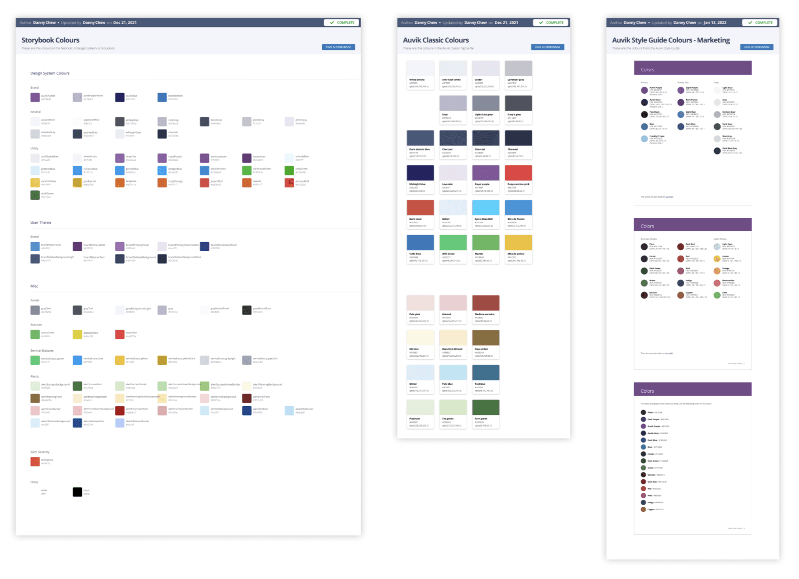
Various Colour Libraries
Iceberg - Figma Design System
Research
As I had prior experience building out a design system at my previous company, it was never to this scale and complexity. So I had to do my initial research in properly setting up and creating a Design System for a web application with existing components and patterns. I studied guidelines and design systems laid out by Google, Facebook, and Apple and assessed Shopify’s Polaris and IBM ‘s Carbon Design System.
Two of the best resources I found were the book Atomic Design, by Brad Frost, and a site called Pattern Lab. Frost’s book detailed the creation and maintenance of robust design systems while Pattern Lab served as an example of what a living design system might look like.
New Colour Scales
Our approach to solve this was to consolidate the colours that existed within the 3 libraries and to trim down the colour palette so that 12 colour scales would cover the majority of the colours.
From this consolidation, we confirmed that there were 9 matching colours, 21 similar colours and 59 unmatched colours between the Auvik Classic Library and the NanookUI library. As a lot of these colours were either very similar copies or variant tints of existing colours, we used this data to design 12 colour scales to cover the variant tints and shades of each colour.

New proposed Colour Scales
Colour Consolidation
I went through the NanookUI library and found that there were over 86 colours in Storybook. Additionally we also had 35 colours in the Auvik Classic Library and 30 colours in the Auvik Style Guide from Marketing.
Various Colour Libraries
Accessibility
We also used accessibility grids to test out the colour scales to see if our consolidated colours adhered to the WCAG guidelines.
Once this had visibility from Engineering and Product Managers, it was then approved by the VP of Product and deployed into JIRA for the Platform UI team to add this to their workflow. I worked with 2 engineers on the Platform UI team to refactor and replace all of the colours within the product to adhere to the new colour shades.

Accessibility Grids
IBM's Carbon Design System
Shopify's Polaris Design System
New Colour Scales
Our approach to solve this was to consolidate the colours that existed within the 3 libraries and to trim down the colour palette so that 12 colour scales would cover the majority of the colours.
From this consolidation, we confirmed that there were 9 matching colours, 21 similar colours and 59 unmatched colours between the Auvik Classic Library and the NanookUI library. As a lot of these colours were either very similar copies or variant tints of existing colours, we used this data to design 12 colour scales to cover the variant tints and shades of each colour.
Documentation
Documentation
One of the pillars of any design system is undoubtedly its documentation. However, the product team will only be able to use it properly if it’s well understood, which defines its success and longevity. Furthermore, good documentation can also facilitate scalability and improvements.
One of the pillars of any design system is undoubtedly its documentation. However, the product team will only be able to use it properly if it’s well understood, which defines its success and longevity. Furthermore, good documentation can also facilitate scalability and improvements.
New proposed Colour Scales
Utilizing Zeroheight
Prior to setting up the design system at Auvik, all of the documentation on how to use and build the react components were scattered across Confluence and Word documents. So we used Zeroheight to integrate the documentation into one web based platform, while also permitting access to design from our Figma library and Code components from Storybook.

Iceberg in Zeroheight
Value to company
Consolidating these libraries into one area enabled easier access for both Marketing and Product. Using Zeroheight also proved to expedite cross-functional Design System adoption within the company.

Live code demo feature within Iceberg
Audit
With a strategy in mind to build out the design system, the first task was to inventory every UI element in our application. I went through our Nanook UI and Web client component libraries in Storybook and inspected our platform to capture every button, input field, and design pattern.
With this exercise, I found that there were dozens of form field styles, single use icons, and incorrectly applied font weights and sizes across the platform.
Audit for all of the Button components
Accessibility
We also used accessibility grids to test out the colour scales to see if our consolidated colours adhered to the WCAG guidelines.
Once this had visibility from Engineering and Product Managers, it was then approved by the VP of Product and deployed into JIRA for the Platform UI team to add this to their workflow. I worked with 2 engineers on the Platform UI team to refactor and replace all of the colours within the product to adhere to the new colour shades.
Accessibility Grids
Launch
We built a fully functional web-based design system called Iceberg that now services approximately 280 employees at Auvik. Working closely with other product designers, product managers, engineers, and various stakeholders presented its own set of challenges, but we were able to work effectively and produce a central hub for all brand and product assets.
Figma Design Kit
So I created a system to categorize the components and patterns effectively, and designed each component to match the Storybook and Web assets. With each inconsistent component, I would review them with the design and engineering teams to refactor them as deprecated assets to be removed. I created the Figma components and variants for each state in Figma and had to make decisions regarding naming conventions, categorization and presentation.
Iceberg - Figma Design System
Next Steps towards Auvik 2.0
Creating a design system is not a one time job, as it has to be maintained.
As I became the design systems lead within Auvik, my position included maintaining the design system to ensure it stayed updated and relevant with new components and patterns. As the company looks to scale and expand towards new product offerings for Auvik 2.0, so will the user interface.
Our team used Gong to record sales and usability calls and Heap and Pendo to gather insights into a customer’s journey, so that we could further improve conversion and retention. We have already started building out some initial concepts for new patterns and components to replace the old ones and will look to revamp the product with a new information architecture and user interface for Auvik 2.0.
Colour Consolidation
I went through the NanookUI library and found that there were over 86 colours in Storybook. Additionally we also had 35 colours in the Auvik Classic Library and 30 colours in the Auvik Style Guide from Marketing.
Various Colour Libraries
Utilizing Zeroheight
Prior to setting up the design system at Auvik, all of the documentation on how to use and build the react components were scattered across Confluence and Word documents. So we used Zeroheight to integrate the documentation into one web based platform, while also permitting access to design from our Figma library and Code components from Storybook.
Iceberg in Zeroheight
Value to company
Consolidating these libraries into one area enabled easier access for both Marketing and Product. Using Zeroheight also proved to expedite cross-functional Design System adoption within the company.
Live code demo feature within Iceberg
Documentation
One of the pillars of any design system is undoubtedly its documentation. However, the product team will only be able to use it properly if it’s well understood, which defines its success and longevity. Furthermore, good documentation can also facilitate scalability and improvements.
New Colour Scales
Our approach to solve this was to consolidate the colours that existed within the 3 libraries and to trim down the colour palette so that 12 colour scales would cover the majority of the colours.
From this consolidation, we confirmed that there were 9 matching colours, 21 similar colours and 59 unmatched colours between the Auvik Classic Library and the NanookUI library. As a lot of these colours were either very similar copies or variant tints of existing colours, we used this data to design 12 colour scales to cover the variant tints and shades of each colour.
New proposed Colour Scales
Accessibility
We also used accessibility grids to test out the colour scales to see if our consolidated colours adhered to the WCAG guidelines.
Once this had visibility from Engineering and Product Managers, it was then approved by the VP of Product and deployed into JIRA for the Platform UI team to add this to their workflow. I worked with 2 engineers on the Platform UI team to refactor and replace all of the colours within the product to adhere to the new colour shades.
Accessibility Grids
Documentation
This in turn caused 2 major issues within Auvik:
One of the pillars of any design system is undoubtedly its documentation. However, the product team will only be able to use it properly if it’s well understood, which defines its success and longevity. Furthermore, good documentation can also facilitate scalability and improvements.
Utilizing Zeroheight
Prior to setting up the design system at Auvik, all of the documentation on how to use and build the react components were scattered across Confluence and Word documents. So we used Zeroheight to integrate the documentation into one web based platform, while also permitting access to design from our Figma library and Code components from Storybook.
Iceberg in Zeroheight
Value to company
Consolidating these libraries into one area enabled easier access for both Marketing and Product. Using Zeroheight also proved to expedite cross-functional Design System adoption within the company.
Live code demo feature within Iceberg


