Industry
Sports Entertainment
Company
theScore Bet / ESPN Bet
Redesigning the Promotions Experience
Redesigning the Promotions Experience
Industry
Sports Entertainment
Company
theScore Bet / ESPN Bet

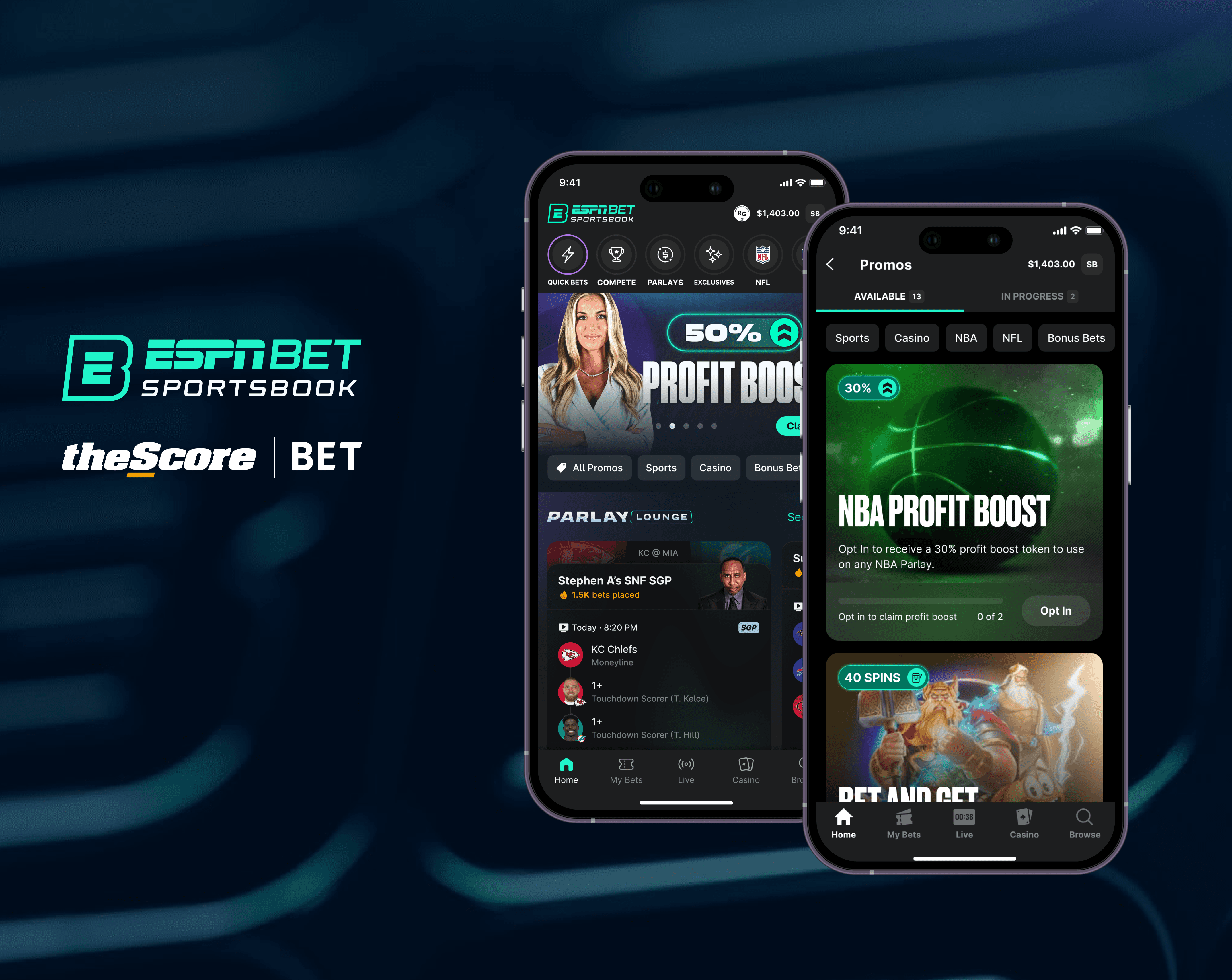
Product
iOS, Android, Web
Role
Product Designer
Timeline
Q1 2025 - Q3 2025
I led the end-to-end redesign of the promotions experience at theScore Bet & ESPN Bet - with focused updates across the Promo Page, Promo Cards, and the Homepage Carousel.
The goal was to improve discoverability, usability, and engagement across all user types — from first-time visitors to long-term patrons.
I led the end-to-end redesign of the promotions experience at theScore Bet & ESPN Bet - with focused updates across the Promo Page, Promo Cards, and the Homepage Carousel.
The goal was to improve discoverability, usability, and engagement across all user types — from first-time visitors to long-term patrons.
I led the end-to-end redesign of the promotions experience at theScore Bet & ESPN Bet - with focused updates across the Promo Page, Promo Cards, and the Homepage Carousel.
The goal was to improve discoverability, usability, and engagement across all user types — from first-time visitors to long-term patrons.
Product
iOS, Android, Web
Role
Product Designer
Timeline
Q1 2025 - Q3 2025
Problem
Users struggle to find relevant offers, act quickly, and grasp promo value at a glance—resulting in missed opportunities and low engagement across the app.
Users struggle to find relevant offers, act quickly, and grasp promo value at a glance—resulting in missed opportunities and low engagement across the app.
How might we provide both patients and healthcare providers with a better, more usable healthcare experience?
Research
Our UX Researcher conducted a three-month study on the promotion lifecycle to analyze patron behavior across the entire promotions experience. He discovered that there was:
Our UX Researcher conducted a three-month study on the promotion lifecycle to analyze patron behavior across the entire promotions experience. He discovered that there was:
Our UX Researcher conducted a three-month study on the promotion lifecycle to analyze patron behavior across the entire promotions experience. He discovered that there was:
Research
Our UX Researcher conducted a three-month study on the promotion lifecycle to analyze patron behavior across the entire promotions experience. He discovered that there was:
This in turn causes 2 major issues:
Low usage of carousel
Users tend to not use the carousel and navigate to the promos page instead
Updating the design or tailoring the promos to a users’ needs would increase interest and engagement
Lack of promo relevance
Users are dissatisfied with finding relevant promos for their betting styles
Most desire more personalized features and an easier way to opt into promotions they are interested in
Difficulty tracking
Many users must produce their own strategies to keep track of their active promos
It’s unclear to users if their actions have successfully been applied to an active promo
Promo Carousel
Low Engagement & Discoverability
Users rarely swipe through multiple promo cards; most only see the first one.
Limited Functionality
Users can't take action (opt in, participate) directly from the carousel as it's purely informational, forcing users to click into a separate page to engage.
Wasted Homepage Real Estate
As a primary homepage feature, it occupies prime space but delivers minimal user value
Low Engagement & Discoverability
Users rarely swipe through multiple promo cards; most only see the first one.
Limited Functionality
Users can't take action (opt in, participate) directly from the carousel as it's purely informational, forcing users to click into a separate page to engage.
Wasted Homepage Real Estate
As a primary homepage feature, it occupies prime space but delivers minimal user value

Promo Carousel
Low Engagement & Discoverability
Users rarely swipe through multiple promo cards; most only see the first one.
Limited Functionality
Users can't take action (opt in, participate) directly from the carousel as it's purely informational, forcing users to click into a separate page to engage.
Wasted Homepage Real Estate
As a primary homepage feature, it occupies prime space but delivers minimal user value
Promo Page
Overwhelming One-List Layout
All types of promos are lumped together in a long single list, so users must scroll excessively to find what’s relevant to them.
Poor Content Organization
No filtering, categorization, or personalization means users can't easily discover promos tailored to their interests or activity.
Frustrating Navigation for All Users
Returning users can't quickly locate specific promotions they've opted into.

Promo Cards
Visual Clutter & Text Overload
Cards are overwhelming and rely heavily on dense, hard-to-scan text to explain promotions.
Poor Visual Hierarchy
Key information, such as the reward value is buried or unclear. Small promo images fail to capture attention or communicate value quickly.
Difficulty Tracking
Unclear to users if their actions have successfully been applied to an active promotion.

Promo Page
Overwhelming One-List Layout
All types of promos are lumped together in a long single list, so users must scroll excessively to find what’s relevant to them.
Poor Content Organization
No filtering, categorization, or personalization means users can't easily discover promos tailored to their interests or activity.
Frustrating Navigation for All Users
Returning users can't quickly locate specific promotions they've opted into.
Overwhelming One-List Layout
All types of promos are lumped together in a long single list, so users must scroll excessively to find what’s relevant to them.
Poor Content Organization
No filtering, categorization, or personalization means users can't easily discover promos tailored to their interests or activity.
Frustrating Navigation for All Users
Returning users can't quickly locate specific promotions they've opted into.
This redesign presented an opportunity to:
Improve discoverability: by aligning layout, filters, and structure across all areas
Deliver a cohesive experience: that meets user expectations across new and returning patron segments
Increase engagement: by making promos more visually compelling and actionable
Support business goals: by enabling marketing teams to better showcase high-value promos and drive usage
Opportunity

Process
So at theScore/ ESPN Bet, we follow a process called Uniform. And this is the process that we also used for each individual feature release. Essentially we go through 10/50/90% review sessions with various stakeholders before we hand off our designs to engineering.

Ideation Workshops
I ran a couple of ideation workshops with our team, which included our UX researcher, PMs, VP of product, and both our Design and research managers.

We used MosCows as a prioritization exercise to align the team on problem areas we wanted to solve for.
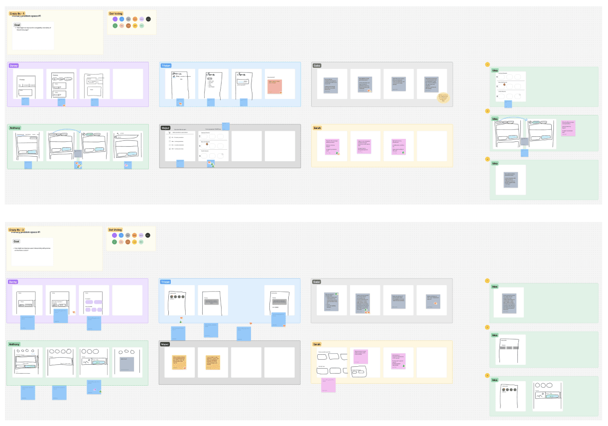
And we used HMWs as a brainstorming exercise to generate quick ideas for these problem spaces. The idea with these workshops is to align as a team before I start my design work
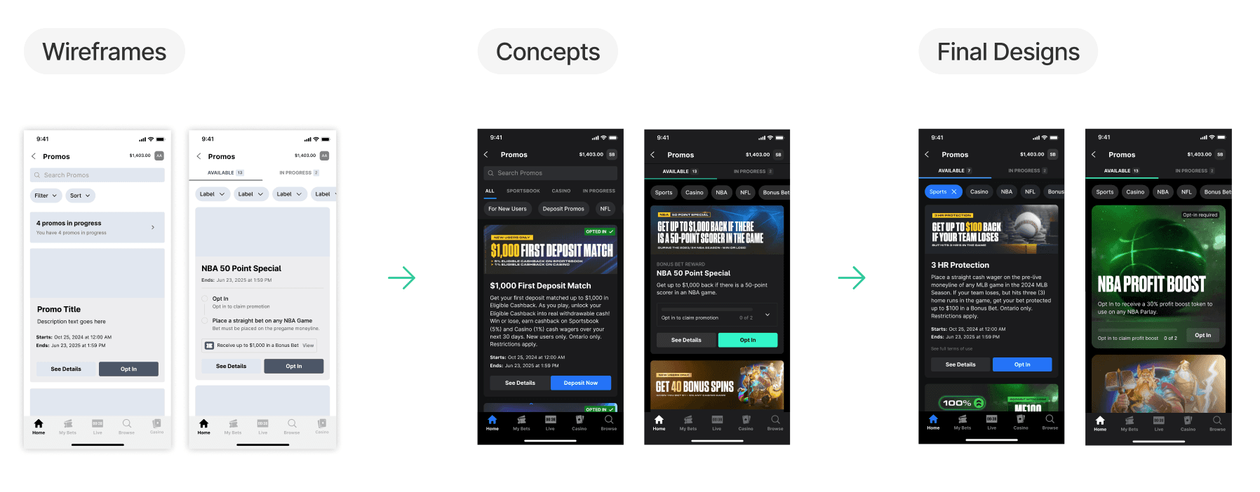
Wireframes to concept exploration
Promo Cards
Visual Clutter & Text Overload
Cards are overwhelming and rely heavily on dense, hard-to-scan text to explain promotions.
Poor Visual Hierarchy
Key information, such as the reward value is buried or unclear. Small promo images fail to capture attention or communicate value quickly.
Difficulty Tracking
Unclear to users if their actions have successfully been applied to an active promotion.
Visual Clutter & Text Overload
Cards are overwhelming and rely heavily on dense, hard-to-scan text to explain promotions.
Poor Visual Hierarchy
Key information, such as the reward value is buried or unclear. Small promo images fail to capture attention or communicate value quickly.
Difficulty Tracking
Unclear to users if their actions have successfully been applied to an active promotion.
Visual Clutter & Text Overload
Cards are overwhelming and rely heavily on dense, hard-to-scan text to explain promotions.
Poor Visual Hierarchy
Key information, such as the reward value is buried or unclear. Small promo images fail to capture attention or communicate value quickly.
Difficulty Tracking
Unclear to users if their actions have successfully been applied to an active promotion.
New Promo Page

New Promo Carousel

New Promo Card

Opportunity
This redesign presented an opportunity to:
Improve discoverability: by aligning layout, filters, and structure across all areas
Deliver a cohesive experience: that meets user expectations across new and returning patron segments
Increase engagement: by making promos more visually compelling and actionable
Support business goals: by enabling marketing teams to better showcase high-value promos and drive usage
Improve discoverability: by aligning layout, filters, and structure across all areas
Deliver a cohesive experience: that meets user expectations across new and returning patron segments
Increase engagement: by making promos more visually compelling and actionable
Support business goals: by enabling marketing teams to better showcase high-value promos and drive usage
Improve discoverability: by aligning layout, filters, and structure across all areas
Deliver a cohesive experience: that meets user expectations across new and returning patron segments
Increase engagement: by making promos more visually compelling and actionable
Support business goals: by enabling marketing teams to better showcase high-value promos and drive usage
Timeline
This project was separated into 3 feature releases, the first being the promo page rework, followed by the promo carousel updates & then the promo card redesign work.
Regarding the promo card redesign work, the goal was to ship the promo cards without tracking first and then do a fast follow release shortly after.
This project was separated into 3 feature releases, the first being the promo page rework, followed by the promo carousel updates & then the promo card redesign work.
Regarding the promo card redesign work, the goal was to ship the promo cards without tracking first and then do a fast follow release shortly after.
This project was separated into 3 feature releases, the first being the promo page rework, followed by the promo carousel updates & then the Promo card redesign work.
Regarding the promo card redesign work, the goal was to ship the promo cards without tracking first and then do a fast follow release shortly after.
Next Steps
So currently 2 of the 3 feature releases are complete - with Promo Card Redesign close to being completed.


So currently 2 of the 3 feature releases are complete - with Promo Card Redesign close to being completed.

Process
So at theScore/ ESPN Bet, we follow a process called Uniform. And this is the process that we also used for each individual feature release. Essentially we go through 10/50/90% review sessions with various stakeholders before we hand off our designs to engineering.
So at theScore/ ESPN Bet, we follow a process called Uniform. And this is the process that we also used for each individual feature release. Essentially we go through 10/50/90% review sessions with various stakeholders before we hand off our designs to engineering.
Micro-animations
While building out these experiences, I also introduced new interaction patterns and motion design - aligning with leadership’s goal to revitalize the app’s UI.
Their support also allowed me to incorporate more blue-sky thinking and explore future-state concepts for the app.
Closing Thoughts
Overall the redesign went extremely well and we already received positive feedback for the work that has been shipped.
Ideation Workshops
I ran a couple of ideation workshops with our team, which included our UX researcher, PMs, VP of product, and both our Design and research managers.
I ran a couple of ideation workshops with our team, which included our UX researcher, PMs, VP of product, and both our Design and research managers.
We used MosCows as a prioritization exercise to align the team on problem areas we wanted to solve for.
And we used HMWs as a brainstorming exercise to generate quick ideas for these problem spaces. The idea with these workshops is to align as a team before I start my design work
Wireframes to concept exploration
Final Designs
Final Designs
We redesigned the promotions experience to improve discoverability, visual clarity, and relevance—adding direct CTAs, smart filtering and progress tracking to help users navigate promotions more easily across all touchpoints.
New Promo Page
New Promo Carousel
New Promo Card
Micro-animations
While building out these experiences, I also introduced new interaction patterns and motion design - aligning with leadership’s goal to revitalize the app’s UI.
Their support also allowed me to incorporate more blue-sky thinking and explore future-state concepts for the app.
While building out these experiences, I also introduced new interaction patterns and motion design - aligning with leadership’s goal to revitalize the app’s UI.
Their support also allowed me to incorporate more blue-sky thinking and explore future-state concepts for the app.
Next Steps
So currently 2 of the 3 feature releases are complete - with Promo Card Redesign close to being completed.
So currently 2 of the 3 feature releases are complete - with Promo Card Redesign close to being completed.
I’m also leading design efforts for our Back Office CMS, focusing on how the marketing team sets up and manages these new promotions & tracking elements.
Timeline
This project was separated into 3 feature releases, the first being the promo page rework, followed by the promo carousel updates & then the promo card redesign work.
Regarding the promo card redesign work, the goal was to ship the promo cards without tracking first and then do a fast follow release shortly after.
Closing Thoughts
Overall the redesign went extremely well and we already received positive feedback for the work that has been shipped.
Overall the redesign went extremely well and we already received positive feedback for the work that has been shipped.
Connect to Content
Add layers or components to infinitely loop on your page.